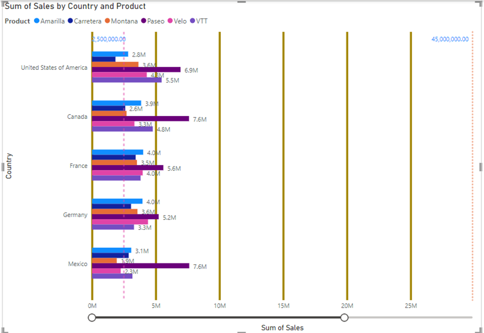
Tooltips:
A tooltip is used to get additional information when mouse is pointed
over data visualization. It shows data based on fields we selected. We can
select as many fields as possible. There are various types of tooltips
available to us in power bi.
·
Felid
level tool tips
·
Default
tool tips
·
Page
level tool tips
·
Text
level tool tips
·
Visual
header tool tips
When
we select default tooltips, it shows data when mouse is pointed over on
visualization.

Ø A page level tooltip shows data
of another page when we point mouse on current page visualization. It helps
user to access data easily without moving to other page for information.
Ø First select page on which we
want data – then select “format your report page” – from it select “Allow use
as tooltip”.

Ø Next move to the page on which
you want data to be shown. Then point mouse on visualization and select
“General option” – then select “Tooltips” – choose “options” – select “Report
page in Type” and “page name”.

Ø Now when you point your mouse on
your data you will get data visualizations from another page.

Ø Like this you can see data
related to other page from current page visualization. It is one of the easiest
way to present data for easy understanding and it is time saving method.
Ø If you want to change this
option, you can again go back to visualized data and choose “Format your report
page – choose “Page Information” - and turn off “Allow use as a tooltip”.

Ø Now, get back to current page
you are using and point mouse on current visualization and select it. Then you
will see options in right side. Select “General option” – turn off “Tooltips”.
Then tooltips will turn off.